(5 min. read)
When it comes to publishing, regardless of whether it’s in print or digital form – be it a trade
journal, catalog, company business portfolio, special interest magazine or consumer title – if
you want to truly resonate with readers, you’d better make a great first impression. GLM has
compiled a list of key design principles that we use every day in our business. Applying these six
design guidelines in your publishing endeavors will give you the credible and professional
appearance that sets you apart from the amateurs.
Set up a Template
You have an email signature that reflects your brand. You may have stationary or letterhead for
your business to ensure that every correspondence has the same branding. The importance of
brand guidelines cannot be overstated. Using a template for your print or digital publications
allows you to adhere to your brand standards in a simple and easily repeatable way. Set your
page header and footer appearances as well as color scheme and font styles. But don’t
overcomplicate things. A font style for your header, one for sub headers and one for the main
body text will suffice. Maintaining those styles on each page throughout the document, as well
as all other related publications, will cement your brand’s written appearance. For more on
creating your brand’s style guide, check out our post on brand consistency and social media.
Minimize the Clutter
We’ve all seen it – that piece without a cohesive color palette, too many different fonts,
inconsistency at every turn – it comes off as unhinged – not a good look. Too much visual
stimulation distracts from the message you are trying to convey. Maintain a simple color
palette that reflects your brand along with two, maybe three fonts or styles that will ensure a
professional product. It doesn’t matter if we’re talking fashion, architecture, industrial design or
in this case, publishing, a timeless appearance is always rooted in intentional understatement.
You want your readers to feel your brand almost subconsciously – not be agitated by it.
Use White Space
Have you ever walked into a minimally decorated room and suddenly felt like you could relax
and breathe? That is the effect the right amount of white space can elicit with a design. This is
done in subtle ways; space between paragraphs, space around graphics; space between
columns and the space from the edge of the text to the edge of the paper. It all matters. A good
standard to use for this is ¼” (0.25”) but be open to more, or less, as needed depending on the
piece. By the way, the key word in the previous sentence was STANDARD.
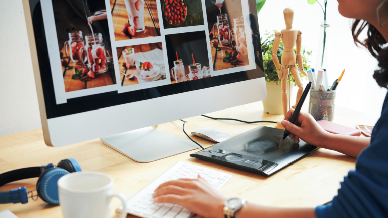
Use Visuals
Notice that we did not specify mixing in photos or illustrations. The use of visuals can be so
many things. It can be geometric shapes, patterns or just a color block. Pairing some of these
elements can work wonders in bringing visuals to life. Position a photograph in that triangle
instead of a rectangle or square. Convert that image to black and white, strip out the
background, and go with a monotone filter overlay. Experiment and have fun! Try using vector
graphics, or when using photographs, make sure they are high resolution so that the
appearance is crisp and clear. When it comes to imagery, nothing screams amateur (or taken
with an early 2000’s flip phone!) like clearly seeing pixelization. If the image includes people,
consider using one where the subject(s) are looking at the camera. Studies show that readers
tend to pause longer on an image of someone looking at them.
Proofread, Proofread, Proofread
Okay, we realize that proofreading is not technically a design element. However, words on the
page count. Take the time and get a second set of eyes – represent your brand in the best
possible light. Nothing is more embarrassing than producing a poorly written piece that is
riddled with typos and misspellings. It slows or halts your readers’ pace and definitely deducts
from your reader trust points. So read it, then read it again. And then have someone else read
it. It’s worth it.
Partner with your Printer
If you plan on having the final piece printed, communicate with the printer. There will be page
sizes, bleeds, trim sizes, and color formats that you will need to follow when setting up the file.
Find out what type of file they expect. Should the fonts be embedded? What resolution do the
photos need to be? There are many specifications that go into a physically printed piece. You
may not need to focus as much on those details when producing a digital publication. However,
it is still wise to design with specifications in mind in case the piece is printed in the future.
What Else?
Follow these six basic design tips regardless of whether the design is for print or digital. Give us
a shout and let us know if you found this helpful, if you think we’ve overlooked some other
great points, or just to say hi.
Creating compelling, relevant content (that looks great!) and connects your business with
existing customers, while driving new customers in the door comes with a tremendous time-
cost. But fret not, this is exactly what GLM Custom does – and we are here to help!
GLM Custom offers full-service sales and marketing capabilities, custom publishing, content
marketing, social media management and a suite of design services.
Visit us at www.glminc.stagingdevs.com